
Hey everyone! It’s Kate here with a fun watercolor experiment! Today, I wanted to loosen up and play with some abstract marks. I grabbed a very wet piece of paper and tilted it slightly to let the water flow downwards. I love how the colors move together on the page!
I’m using a limited palette of Violet Red, Madder Red, and Payne’s Grey. I’m also playing with texture by blotting and using different techniques. I dabbed some leftover water at the bottom of the page with a paper towel and then rubbed it around to see what kind of marks it would leave.
Next, I went back in with my brush to add more color without thinking about shapes or anything specific. I’m having so much fun with the freedom of just playing with color and my brush. This quill brush is one of my favorites – it holds a ton of water and comes to a nice point for detail work.
I added a little bit of the Payne’s Grey here and there to pick out some of the natural edges and add some contrast without overwhelming the page.
Since most of the paper was still wet, the paint spread out in interesting ways. After drying, I went back in with some Olive Green, adding small touches and blending them above the first layer. I wanted the green to be soft and not have any hard edges.
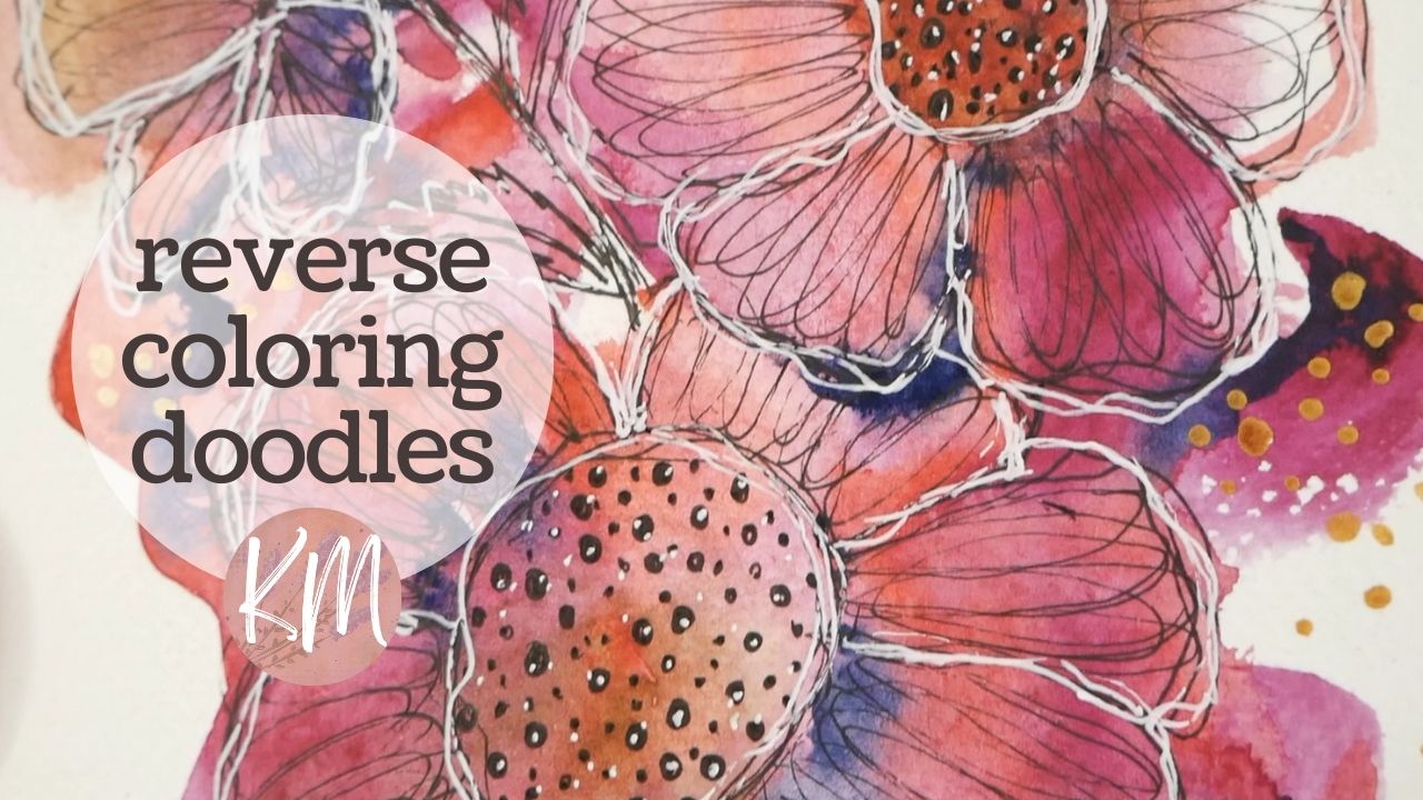
With both layers dry, I grabbed my micron liner and started doodling flower petals. It wasn’t planned, but the shapes just popped out at me from the paint blobs. I love these sketchy, scribbly flowers! I added stems and leaves to a couple of them, and this turned out to be a piece I really enjoyed creating.
It felt like looking up at the clouds as a kid and trying to see shapes in them. It’s interesting how our brains work to find patterns and make sense of things. I then added my favorite dots to the centers of each flower.
I wanted to add some more variation and detail to the petals so they would stand out more from the background paint. I experimented with drawing more petals and ended up with these loopy scribbles. It relaxed me to just let go with the pen, and I think it added some texture and made the flowers pop without covering up the paint underneath.
Once I finished the flowers, I grabbed my white Gelly Roll for highlights. It really made the flower petals stand out and changed the whole look of the doodle. I love the sketchy lines and how it adds a pop of white against the colorful background.
Finally, I felt like adding some sparkle with my gold watercolor paint. I used Royal Gold, which has a nice shimmer and gets quite opaque when wet. I dotted some gold in some open areas and let it flow outside the lines of the paint for a more organic look.
This was a super fun experiment! I hope you enjoyed watching and will give it a try yourself. Just grab your brush, some watercolors, and loosen up! Thanks for your support, and until next time, keep creating!