
Reference Photo: https://unsplash.com/photos/-83_vqs20y0 by Léon McGregor
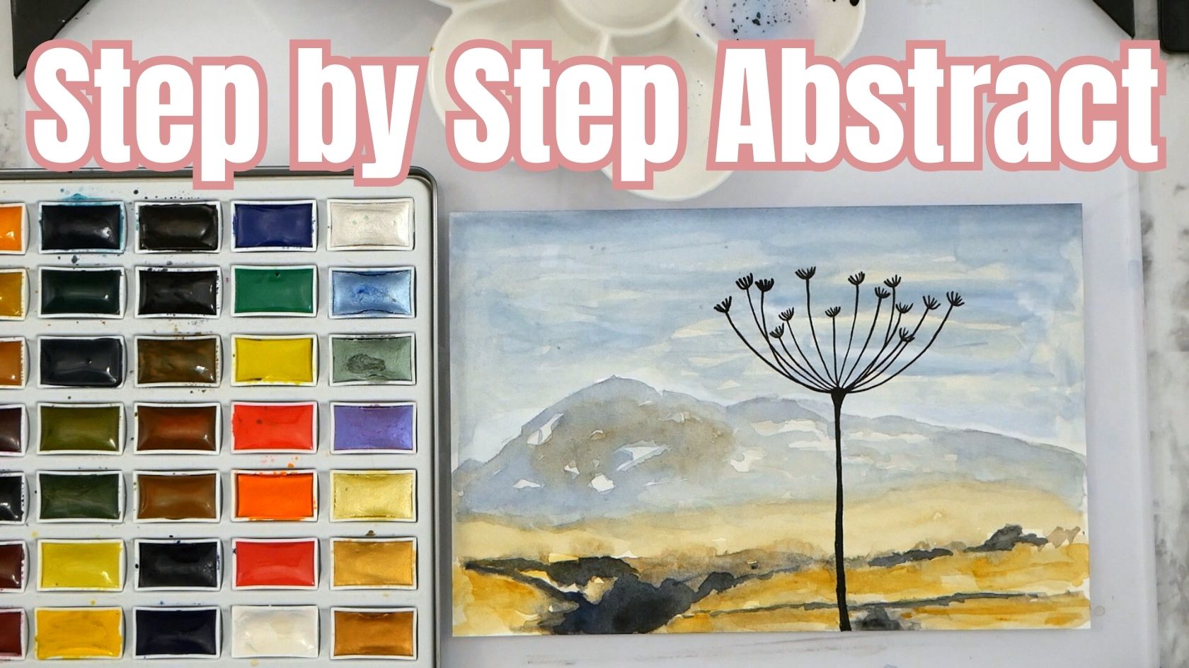
Hey everyone, it’s Kate back with another watercolor painting! Today, I’m taking a different approach and using a black and white reference photo for a loose and abstract landscape. This is a great way to practice values, and you can get creative with the colors!
I found this cool reference photo on unsplash.com, and you’re welcome to download it and paint along with me if you’d like.
First, I prepped my materials: some water, my trusty cotton paper, and my MozArt Komirebi palette. I also grabbed my new size five quill brush from Art Brush China – I did a whole Temu unboxing video on these recently, you might want to check it out!
Alright, let’s get started! I spritzed my palette with some water and started with a light wash of yellow ochre. I wanted to create a desert feel, so I imagined mountains in the background.
Next, I brought in some grays and blues – a deep blue for the mountains and Payne’s Grey for some depth. I also added a touch of black for some nice richness.
For the brushwork, I’m using a lot of washes and loose strokes. This is all about capturing the feeling of the landscape, not replicating every detail.
Building up layers, I added some burnt umber and more yellow ochre for the foreground. I kept the mountains a bit faded in the back and let the blue bleed into the foreground for a nice transition.
This quill brush is amazing! It holds a ton of water and lets me create thin lines as well as washes. I love how versatile it is.
While the first layer dries, I went back into the sky with some more blues and whites. I wanted a faded look, with some room for clouds.
Now, for the fun part – adding details! I used Payne’s Gray and more burnt umber to build up the shadows and textures in the mountains and foreground. I even snuck in a little yellow ocher to create some pops of color.
I used some leftover yellow ocher in the sky to create a hint of sunshine peeking through. Since the photo is black and white, this little touch goes a long way.
This is my first time really painting from a photo, so it’s interesting to see how I can interpret it and keep things loose. I’m excited to see how it turns out!
Once the first layer dried, I went in with a round brush for some finer details. I darkened the shadows in the mountains and sky, and added some richer blues and blacks for contrast.
I brought in even more blacks and deep blues to create some dramatic depth, especially in the central area. I love how the blue adds a cool contrast to the warm yellows and browns.
Next, I mixed some burnt umber and deep blue to create a nice dark brown for the shadowy parts of the mountains. I softened some edges here and there for a smoother transition.
Now, for a little more texture, I dotted some brown and yellow ochre in some areas of the foreground.
I think this is coming along nicely! It’s abstract, but still captures the essence of a landscape with mountains and a desert-like feel.
For the finishing touches, I used a black acrylic paint marker to create a small plant in the foreground. This adds a little detail and interest without taking away from the loose feel of the painting.
There you have it! This is definitely not a replica of the reference photo, but that was the whole point. I played with the light source, made some personal color choices, and ended up with a unique and abstract landscape.
I hope you enjoyed painting along with me today! If not, maybe next time. Until then, keep creating!