
Hey everyone! Today I wanted to do a quick watercolor abstract painting with some doodles, so grab your paints and let’s get creative!
I started with some greens and blues, making loose blob shapes on my watercolor paper.
Next, I mixed some yellow ochre with the green and went around the sides of the painting, adding some darker areas for contrast. I also swiped some paint at the bottom, that went a little further to the edge than I intended. I went back over it with clean water to lighten it up a bit.
I limited my palette today, mostly using greens and adding some blue, which is one of my favorite colors to work with. I love the rich blues in this palette, especially the turkey blue and Prussian blue. Payne’s Grey is another great color in this palette for adding darks; I hardly ever use black these days.
I continued adding contrast with a darker blue, wetting the sides of the paint to let it feather out a bit. This New York Central paper is great because it stays moist for a long time, allowing you to work with it for several minutes before it dries.
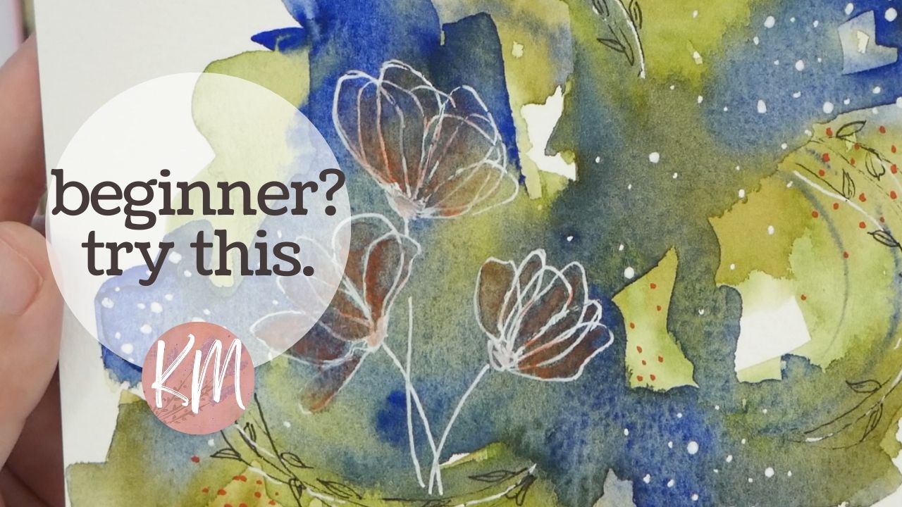
To add some more details and interest, I grabbed my fine liner pen and doodled some circles and crescent shapes on the painting. I also blotted some excess water with a paper towel to avoid soaking up too much paint.
This paper takes second coats really well, so I went in with more green and blue, softening the lines left by the watercolor brush. I like letting the colors blend together a little bit, which creates a richer look as the watercolor dries.
When I do these abstract paintings, I don’t really have a plan in mind. I’m just playing with paint, loosening up, and getting to know my paper and paints. It’s a lot of fun!
After the colors dried, I used a micron liner pen to draw thin black lines around the original circle shapes made with the brush. I also added some doodles in the darker blue areas, like little leaves, for extra texture.
I then grabbed my white Gelly Roll pen and doodled three loose flower shapes. I really like the loose, sketchy look for florals and leaves. I don’t try to make perfect shapes; it’s all about doodles from the imagination.
To add some contrast, I used dots with the white Gelly Roll pen, especially in the darker blue areas. I varied the dot sizes and made them more scattered towards the center, creating the illusion of them floating or exploding inwards.
Finally, I decided to add a little bit of a contrasting color, so I grabbed a red watercolor and put a few dots around the green areas. I also experimented with filling in some of the flower petals with red watercolor. I’m glad I added this; it’s a nice extra touch!
Even though the red is a little toned down because it’s over the darker color, it actually worked out perfectly.
That’s it for this video! I hope you enjoyed it. If you did, consider subscribing and giving it a thumbs up. Thanks for watching and creating along with me! Until next time, keep creating!