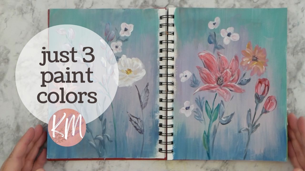
In today’s video, I decided to create a two-page spread in my art journal using a limited palette. I wanted to challenge myself and explore what I could achieve with just three colors: blue, red, and yellow.
I started by pre-painting the background with a mix of the three primary colors, aiming for a neutral and slightly bluish-gray tone. Acrylic paint is my go-to for this because it’s nice and opaque. I thinned the paint a little with water to help it spread better.
Then, it was flower time! I felt like creating abstract blooms, so I played with my filbert brush, mixing brighter colors to make them pop against the background. I mixed some reds, pinks, blues, and even some lavender tones. I wanted some variation, so I kept mixing new colors as I went along, adding white for highlights and creating a sense of dimension.
Lately, I’ve been enjoying these little exercises in my art journal because they allow me to practice and explore different things. This YouTube channel has actually been a big help in keeping me consistent and motivated. It’s interesting to see how my confidence has grown over time, and I’m excited to keep learning and trying new styles.
Next, I grabbed some white to add contrast with some white flowers. I also went back over some of the other flowers to add more white and create some brighter pops of color. It’s so handy to have a palette like this where you can see all the colors you’ve mixed right there.
As I paint, I revisit areas and add details as sections dry to avoid colors from muddying together. I also wanted to make sure the flowers had some variety, so I played with the colors of both the petals and the centers. Small details like this can make a big difference.
For the stems, I decided to explore a range of colors using the same three primaries. I mixed some new colors, adding earthier tones and darker greens, to create some loose and expressive lines. Previously, I wanted to establish where everything would connect on the page before diving into the stems.
After placing the flowers, I went back to add details to the buds, like the tiny leaves that surround them. I love those little white flowers – they add such a cute touch and a pop of brightness to the neutral background.
Since this is a journal spread, I wasn’t too concerned about precise lines for the stems. I kept things loose and playful.
One of my favorite things about finishing an art journal project is taking out the protective cardstock from behind the pages. It lets me see the artwork without the background distraction. This is the finished product! You can see all the different brushstrokes and the variety of colors achieved with just a limited palette.
I hope this video inspires you to grab your supplies and create something with a limited palette. You’d be surprised at how much you can do with just a few colors! Happy creating!

