
Hey everyone, Kate here! Today’s video is all about creating a beautiful Christmas card using watercolors.
I decided to go with a festive theme using deep reds and purples. I wanted a loose and flowy feel, so I started by wetting my watercolor paper on both sides. Then, I grabbed my favorite tools: my MeiLiang watercolor palette and a quill brush.
For the paint, I kept it simple with just two watercolors – purple and magenta. I dipped my brush straight from the pan and went straight onto the paper, letting the colors flow and blend together organically. There wasn’t a whole lot of planning involved; I just wanted to get the colors down quickly while they were still wet.
I love how these watercolors work together; the colors remind me of beautiful galaxies. The neat thing about these quill brushes is that they hold a ton of water.
As the first layer dried, the colors spread and softened even more. I also alternated between the two colors to create some variation in value, with some lighter and darker areas for more visual interest.
Once I was happy with the first layer, I grabbed a smaller round brush and went in with the same two colors to create little cloud shapes. One of my favorite techniques is to drag the color to soften the edges. This creates a beautiful contrast between the hard edge and the dark color against the softer background.
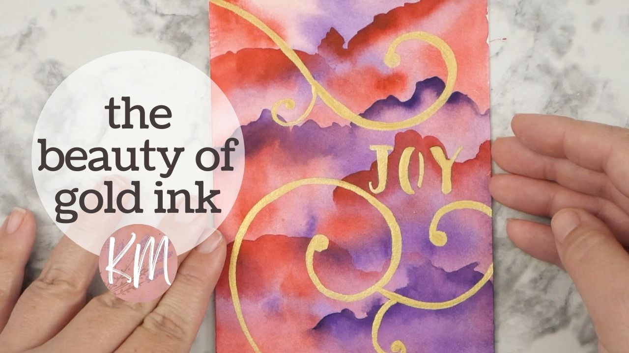
I love how the transparency of the watercolor allows the bottom layer to peek through – it adds so much depth! I was also really excited to incorporate some gold ink into this project – perfect for a Christmas card, don’t you think?
While this technique would look great in an art journal page, it also translates beautifully onto a card.
The entire process was so relaxing – watching the watercolors flow and moving the brush around the paper is pure joy for me.
Another tip – if you’re wondering if you should add a second layer of watercolor, absolutely go for it! Because watercolor is so transparent, you can easily build up color and richness by letting the first layer dry and then going over it again.
To create the lovely curved lines, I used a French curve tool. I simply traced the pencil lines I sketched beforehand to ensure everything was nice and neat before going in with the ink.
Speaking of ink, I also used a stencil to add the word “Joy” onto the card. I debated between using a pen or marker, but ultimately decided to go with my gold ink – the perfect color to complement the red and purple background.
This technique is perfect for creating quick and easy cards. The best part? It’s almost like a zen process – relaxing and meditative. While I used a brush for the ink, you can easily substitute it another tool you have on hand, like a dip pen.
This beautiful Christmas card is all finished. I hope you give this technique a try using the supplies you have at home. Until next time, happy creating!